Attraction Documentary
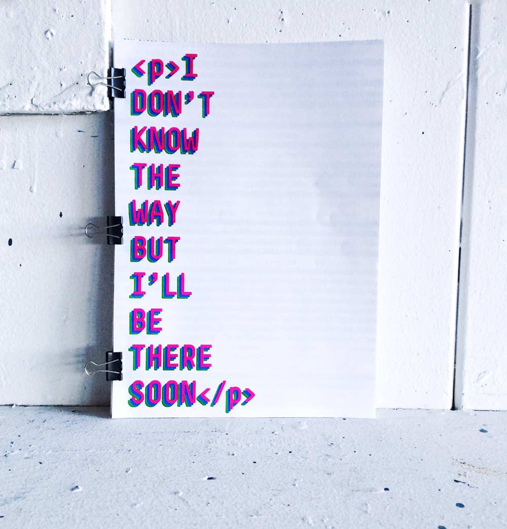
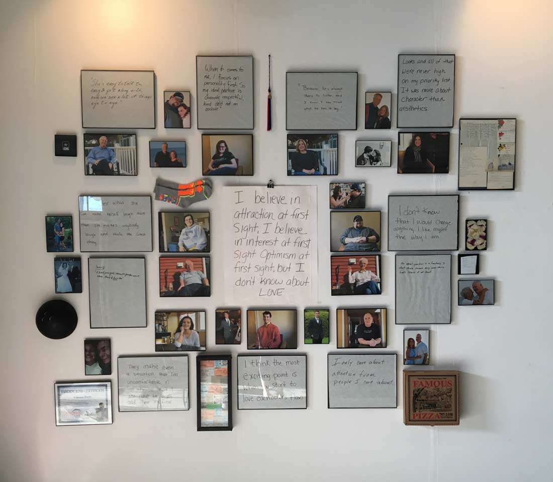
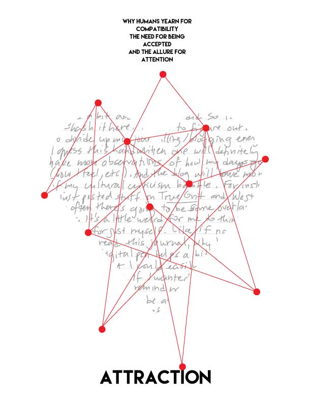
This was my final thesis project for graphic design. I wanted to focus on the attraction we feel when we first fall for someone. I interviewed 11 family members and friends with their significant others. They ranged in age, relationship status and ideas about finding someone. I asked them all the same set of questions, filmed their responses and built a short documentary around it. I then displayed quotes from their answers and had them each write it in their own handwriting. I hung pictures of each person as well a with their significant others. I then chose objects to represent each person that had to do with their attraction to the other person. I also took all their answers and made a keepsake book for each person to remember the project.
Thesis Progress
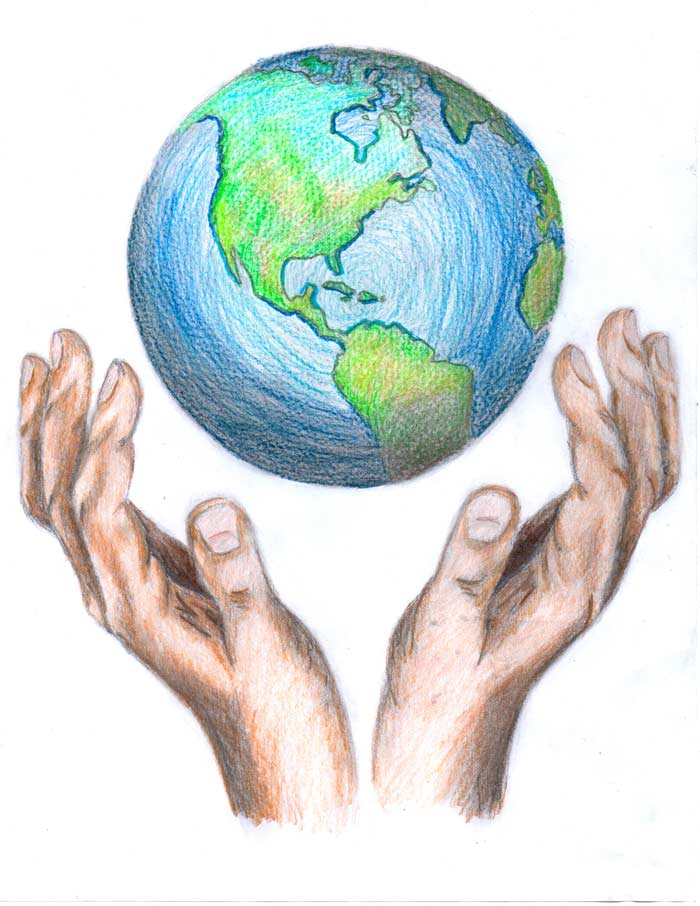
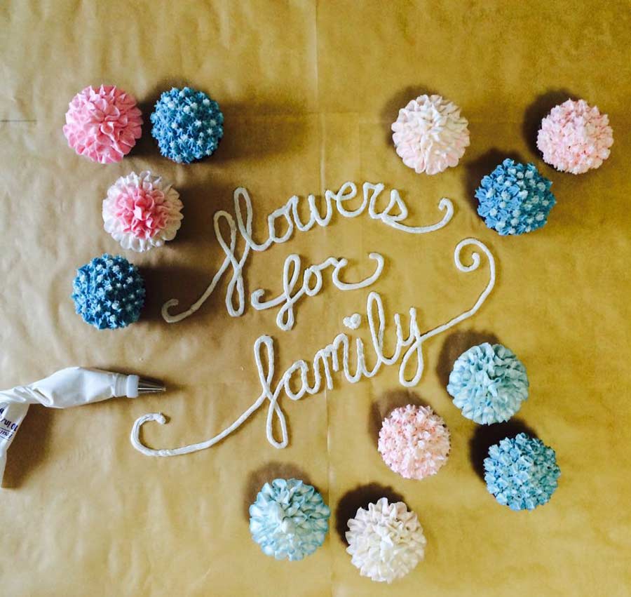
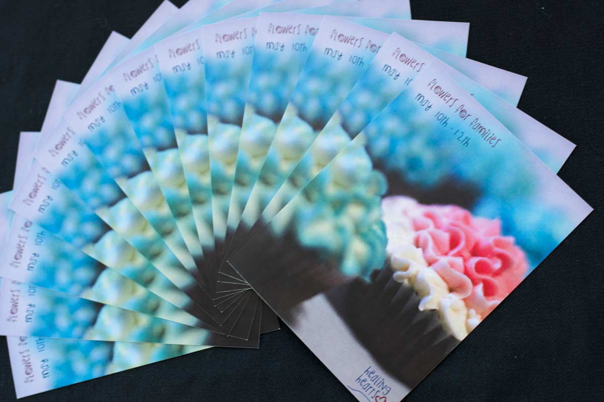
Fictional event I created based on a five year plan we wrote in graphic design studio. I wanted to be an owner of a bakery as well as create a program that helps children with the death of loved ones. I was influenced by a real company called Healing Hearts that helped many of the families in the Sandy Hook Elementary School shooting, as well as my cousin who lost his mother, my aunt. The idea was that I would make cupcakes in the bakery that looked like flowers and for each one sold, money would be donated to the healing hearts program. There they would use the money to buy flowers and invite the families to a day of planing new life and getting to share their stories with other people.
Taco Tuesday
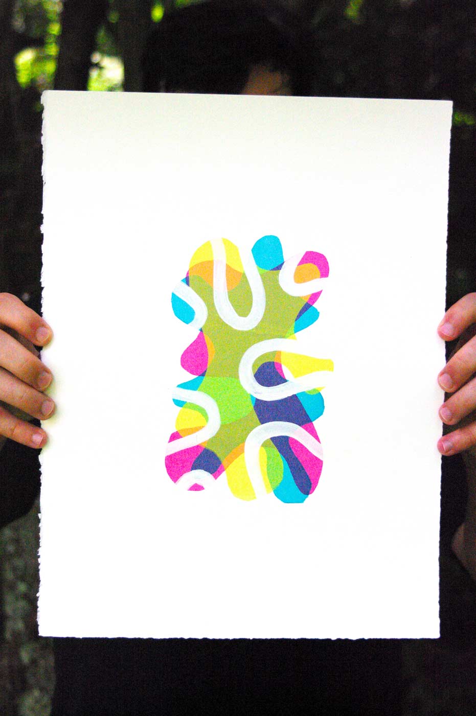
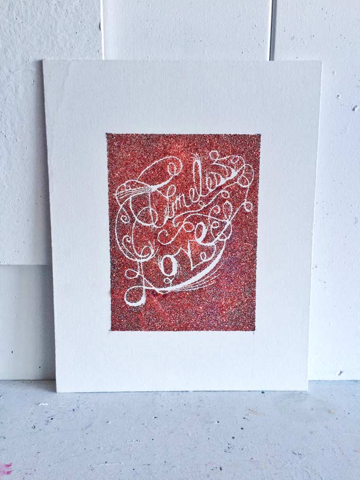
Advanced Printmaking project. I wanted to focus on the idea of identity. Each print is unique in the set of 30. Used 9 organic shapes and combined them together in different sets of three for each print. Those were silkscreened, and then I hand panted while outlines in a new shape to represent the unique forms each person takes in the world, as well as the paths they travel to make them who they are.